From 48 fragmented systems to one unified learning platform for 450,000+ defence users

Led the end-to-end design of a complex B2B ecosystem, improving usability and access accross Ministry of Defence.
Lead Product Designer

Ministry of Defence

2026

Team of 85

Lead Product Designer

Ministry of Defence

2026

Team of 85

Modern home office setup with a monitor, ergonomic chair, keyboard, and indoor plants near a window with blinds.

Note: Due to NDA constraints, original deliverables are redacted.

Context

Defence personnel could not access or prove their learning history, which was slowing career progression and operational readiness.

At the same time, learning data was fragmented across 48+ disconnected systems, making even simple tasks painful. 

Role & Impact

I worked as a Lead Product Designer on a UK Ministry of Defence programme to design an ecosystem of 8 learning products used by 450,000+ personnel.

My role spanned vision, design leadership, and delivery across multiple teams.

48 systems reduced to 1 record 
Adopted by 450,000+ users
Download in under 2 minutes 

Challenge

Users had no central record of their learning data:


  • Data was scattered across multiple of systems

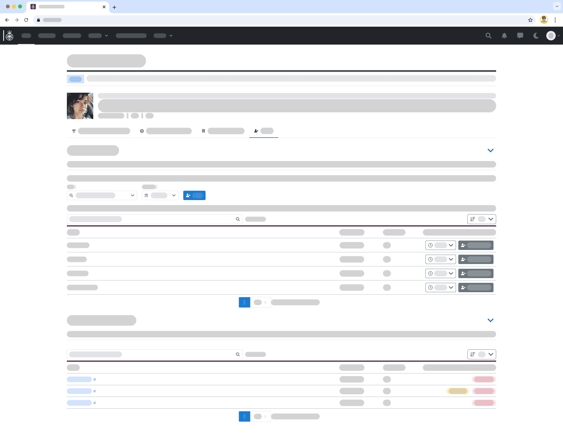
  • Records could not be shared or downloaded

  • Interfaces were cluttered and hard to navigate

This created real consequences:


  • Slower career progression

  • High cognitive load for users

  • Inefficient workforce planning for the organisation

Solution

I designed an MVP learner record that centralised outcomes and enabled secure sharing of a user's learning history.

Approach

User-centred design

Ran multiple rounds of user research, uncovering 45+ pain points around clarity, accessibility, and interaction 

User-centred design

Ran multiple rounds of user research, uncovering 45+ pain points around clarity, accessibility, and interaction 

Clear hierarchy

Made cluttered screens easier to use by prioritising and organising information more clearly

Clear hierarchy

Made cluttered screens easier to use by prioritising and organising information more clearly

Fast iteration

3 design versions, improving:

  • visual clarity

  • interaction patterns

  • download flow comprehension

Fast iteration

3 design versions, improving:

  • visual clarity

  • interaction patterns

  • download flow comprehension

Design Iteration

01 / 03
a woman wearing headphones sitting in front of a laptop computer

Team lead

"It's dependent on somebody sharing, so if it's a unit and you were trying to gather, how many people had done a specific course. You would like to understand, as someone who is leading a team, which competencies are in the team."
01 / 03
a woman wearing headphones sitting in front of a laptop computer

Team lead

"It's dependent on somebody sharing, so if it's a unit and you were trying to gather, how many people had done a specific course. You would like to understand, as someone who is leading a team, which competencies are in the team."

User feedback on design iteration

UI states tested
Key insights & opportunities

Pain

Accessibility and visual strain

Poor contrast, small text, and dense layouts make the VLR hard to use, particularly for dyslexic and visually impaired users.

HMW

How might we ...

help users clearly understand what actions they can take in the VLR and how to take them?

Value

Value

reducing barriers for people with different accessibility needs. It would likely lead to fewer errors, faster comprehension, and improved user confidence

Pain

Accessibility and visual strain

Poor contrast, small text, and dense layouts make the VLR hard to use, particularly for dyslexic and visually impaired users.

HMW

How might we ...

help users clearly understand what actions they can take in the VLR and how to take them?

Value

Value

reducing barriers for people with different accessibility needs. It would likely lead to fewer errors, faster comprehension, and improved user confidence

Pain

Limited interactivity and poor mental model fit

Course titles are not clearly clickable, drill-down is limited, and actions like re-enrollment or retakes are not obvious.

HMW

How might we ...

help users clearly understand what actions they can take in the VLR and how to take them?

Value

Value

help users clearly understand what actions they can take in the VLR and how to take them?

Pain

Limited interactivity and poor mental model fit

Course titles are not clearly clickable, drill-down is limited, and actions like re-enrollment or retakes are not obvious.

HMW

How might we ...

help users clearly understand what actions they can take in the VLR and how to take them?

Value

Value

help users clearly understand what actions they can take in the VLR and how to take them?

Pain

Unclear search, filtering, and download behaviour

Download functionality is ambiguous and does not meet expectations for certificates or tailored exports.

HMW

How might we ...

ensure search, filtering, and downloads behave in ways users expect and can rely on?

Value

Value

improve efficiency and reduce frustration by helping users get the exact information or documents they need.

Pain

Unclear search, filtering, and download behaviour

Download functionality is ambiguous and does not meet expectations for certificates or tailored exports.

HMW

How might we ...

ensure search, filtering, and downloads behave in ways users expect and can rely on?

Value

Value

improve efficiency and reduce frustration by helping users get the exact information or documents they need.

Outcomes

Dark theme earier to use for accessibility users

Involving early users helped uncover real pain points quickly and prevented costly assumptions.

Regonisable icons accelerate page navigation

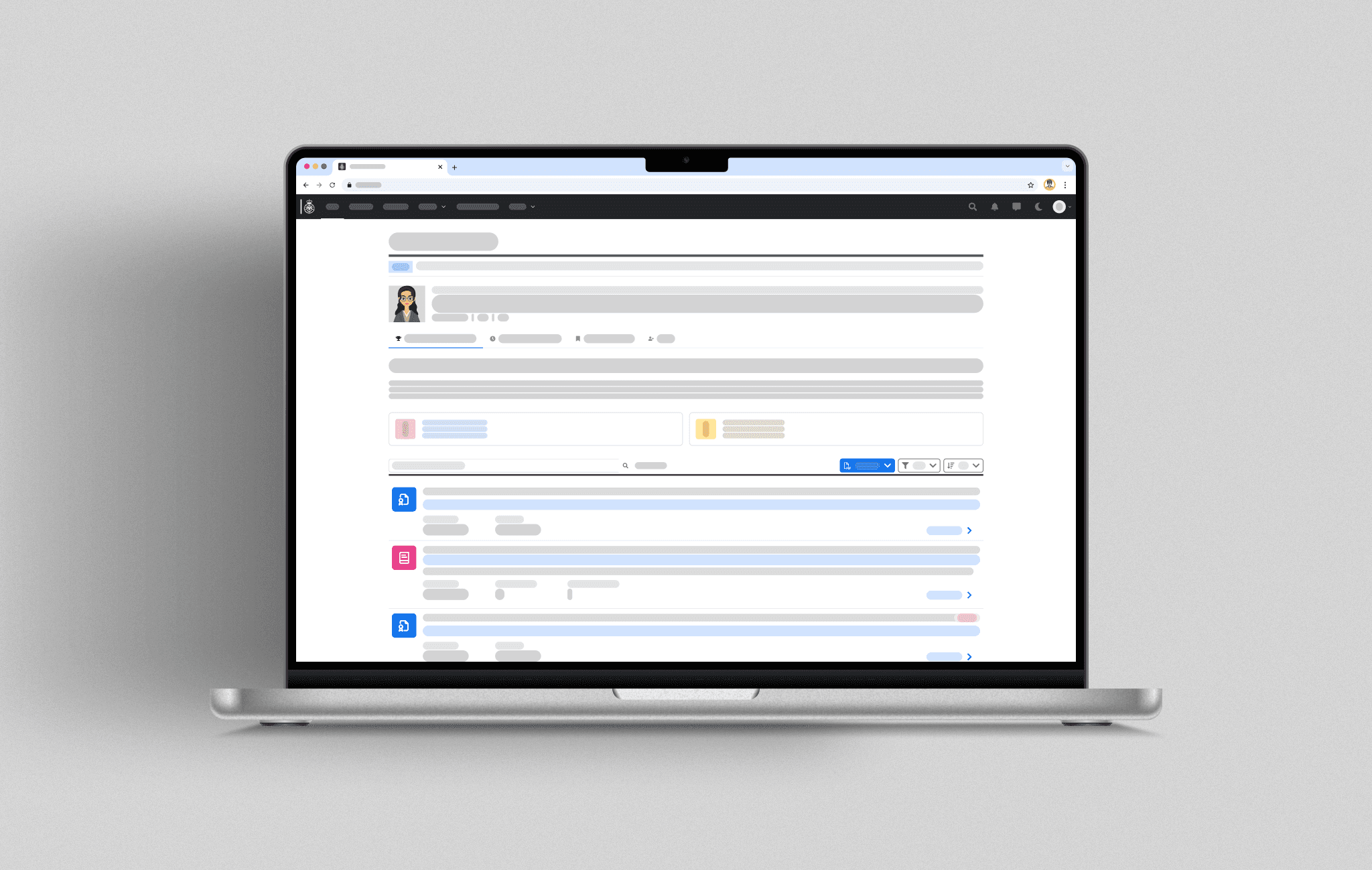
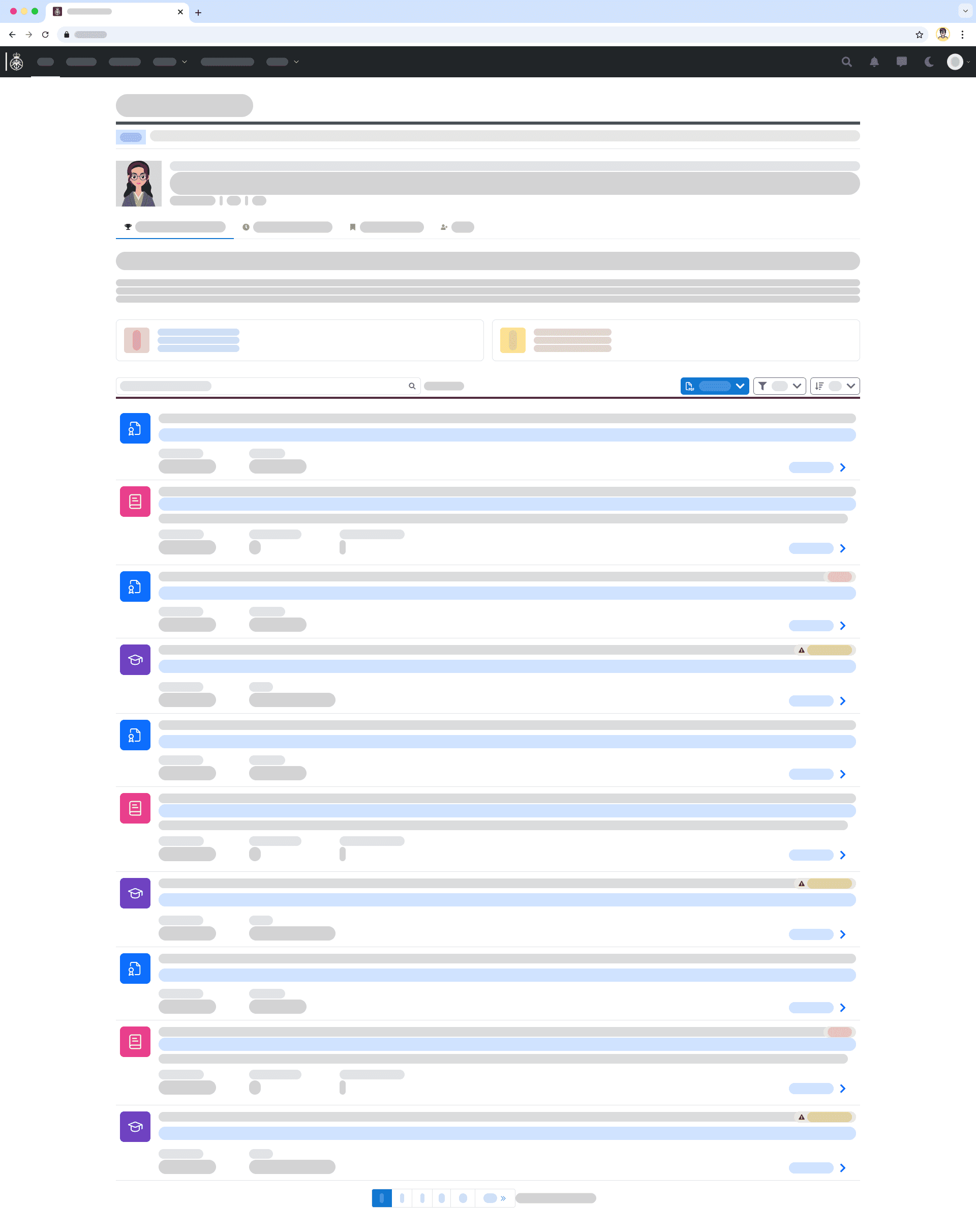
Custom icons and colour coding distinguish each item category, making them easier to scan and improving accessibility.

Improved download flow decreased user confusion

A flexible download flow that starts from a single dropdown, allowing users to download the full list, individual items, or selected items, with the next steps adapting based on their choice.

Interactive tiles provide quick access to filters

Expired and expiring items are surfaced as interactive tiles, showing what needs attention at a glance and allowing users to filter the summary list below directly.

Reflections

Learnings

Work with early adopters

Involving early users helped uncover real pain points quickly and prevented costly assumptions.

Start with an MVP

Shipping a focused first version enabled faster learning and structured collaboration with BAs.

Protect focus time for the team

Meeting-free afternoons and clear team rules improved design quality and delivery speed.

Build team safety

Actively supporting one another strengthened collaboration and trust within the team.

Trade-offs & Constraints

Advocated for the user perspective in a technical team

Joined as the only designer and had to actively challenge assumptions to ensure user needs were represented.

Worked under tight timelines for user validation

Delivered rapid research to meet Alpha timelines while maintaining sufficient evidence for decision-making.

Managed research in a wider, interconnected system

Conducted research on a service that depends on multiple other systems, creating risks when working in isolation.